We recognize beauty when we see it. Each of us vividly remembers encountering something aesthetically pleasing to the eye — we stopped what we were doing and stared at the sunset, a face, a pet, or a painting. We were so captivated we did not ask what made it so appealing.
Aesthetically pleasing refers to stimuli that are beautiful to the senses and are known to have certain elements in common. They are symmetrically balanced, proportional, colorful, rhythmic, and contrasting. Aesthetically pleasing stimuli almost always fulfill the definition of the “golden ratio,” which is a marvelous principle of beauty.
While we all recognize beauty, we do not give much thought as to why we find some things so attractive or what all truly beautiful things have in common. Here, we will review those simple elements that visually pleasing things possess.
Shared Qualities of Aesthetically Pleasing Sights
Before we can describe the aesthetically pleasing qualities, let’s be clear on what the word “aesthetically” means. We hear people use this word when describing beautiful art, music, literature, and even people, but what does it mean?
It is always good to consult a fine dictionary, for instance, The Oxford Dictionary of English Etymology (you can find it on Amazon), when trying to understand the finer points of an idea. This is especially true when trying to grasp a concept that is so important for our discussion as the word “aesthetically.”
“Aesthetic” is an adjective, a descriptive word, that means dealing with beauty or the appreciation of beauty and beautiful things. So if something is aesthetically pleasing, it is literally pleasing because it is beautiful to the senses.
It is important to know the word “aesthetic” can also be a noun. It refers to the ideas, principles, or rules that go into making something aesthetically pleasing (source).
We will talk about these guidelines below but, for now, let’s use an example to illustrate this point.
What Makes Something Aesthetically Pleasing
Think of your favorite photograph of a smiling child. The photograph is aesthetically pleasing because it perfectly embodies what you find beautiful.
You might say, “I find this photo beautiful because the child is smiling, which uplifts the lines of her face, and the lighting illuminates her eyes and cheeks.”
Your description of what makes the photo beautiful is the underlying aesthetic — your rules for what makes something beautiful to the senses and pleasing to the eye.
Because we have five senses, we can say that there are five possible ways for things to be aesthetically beautiful.
For instance, an apple can be beautiful in its appearance, the way it feels to our touch, its scent when we hold it to our nose, the sound it makes when we bite into it, and its flavor when we taste it.
When people refer to something as aesthetically pleasing, they are mostly talking about its visual presentation: how it looks. So, if something is aesthetically beautiful, it is pleasing to the eye.
Artists, scientists, engineers, architects, and designers are all in accord that the aesthetic, meaning the underlying guidelines, of what makes something pleasing to the eye, has certain basic elements (source). Below is a list of the guidelines with examples of each.
Color
Every color has a different emotional impact on us. For instance, green is the most pleasing color to the eye. Brown is a comforting, relaxing color. A painting meant to be calming will have shades of greens and browns.
Pattern
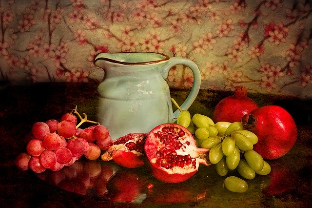
In visual art, a pattern is a line or object that looks similar to other lines and objects which repeat. For instance, in a “still life” painting of fruit in a bowl, each piece of fruit, though distinct from one another, has a similar, round appearance.
The fruit may also have matching shades of color. Other like objects may appear throughout the painting so that the eye is pleased by the pattern.
Shape
There are three basic shapes used in artistic design: circles, squares, and triangles. Images we see in paintings and photographs are combinations of these three shapes.
When the shapes are symmetrical, which means they appear to be evenly balanced, it is most pleasing to the eye. We will revisit the topic of shape when we discuss the golden ratio.
Line
There are five basic lines in art, and each one implies a message to the viewer. Horizontal lines, straight from right to left, imply calmness and width. Vertical lines, straight up and down, imply strength and stability.
Diagonal lines, sideways top to bottom, imply movement and instability. Zigzag lines are really diagonal lines joined at the ends; they imply action and instability. Curved lines, changing direction gradually, imply comfort and sensation. Curved, horizontal lines are the most pleasing to the eye.
Texture
Texture is a visual way of suggesting to the viewer how an object in a painting or drawing would feel.
Cross-hatching — using straight lines vertically and horizontally — makes an image “feel” rough. Gentle shading, suggesting smoothness, is the most pleasing texture to the eye.
Weight
Weight is the use of lines, texture, and shading to imply the degree of heaviness of an object in a drawing or painting.
For instance, an artist would draw an apple with slightly wider lines, and with darker shading than the artist would draw a lemon. These differences imply the apple weighs more.
Proximity
When an artist places objects closer together in a painting or drawing, the artist implies that in some way, they belong together.
One classic example of this principle is Leonardo da Vinci’s Last Supper, in which all those portrayed gather in clusters of two or three, except two figures who are isolated from the others, Jesus and Judas.
Movement
Movement — in paintings, drawings, photos, and other media of visual art forms — means an object appears about to be in motion. An artist’s goal is to capture an instant in time when a motion was occurring.
An example of this is a painting or drawing of a live animal. The animal doesn’t need to appear to be moving. Rather, the “movement” is the timelessly captured instant in which the animal is still.
If you go back to those still images, whether they are paintings, drawings, or photos, that you find to be most pleasing to your eye, you will also very likely find each of these visual elements. You will probably also discover the golden ratio is present.
What is the Golden Ratio?

The golden ratio, which also goes by the names the golden mean, the golden section, or, in art, the divine proportion, is really a mathematical concept that is easy to see, but not so easy to describe (source).
The quickest way to envision this is to take a piece of paper and draw a rectangle that is twice as tall as it is wide — a vertical rectangle. Now draw a line, left to right, that is one-third of the way down the page.
Behold, you have created another smaller rectangle on top of the original that is one-third as large as the first one you drew.
Now, draw a line across this smaller, sideways rectangle that is one-third of its length. You have created a third rectangle that is vertical — up and down — and one-third the size of the second and one-sixth the size of the first.
You can continue making these new rectangles until they become so small you can’t draw anymore.
So why are these trisected rectangles important to aesthetics and to art that is pleasing to the eye? Take a look at your favorite painting, portrait, or photograph that you find particularly pleasing to your eye.
Now, imagine the image divided into thirds. Is your eye drawn to one of those thirds in particular — perhaps the middle third? Look closely at the interesting third and imagine it divided into thirds.
Which of those thirds is your eye drawn to, and what is interesting about it?
Master artists, like da Vinci, Michelangelo, and Rembrandt, were very precise in using the golden ratio in their art. What they were using was not merely an artist’s technique, however.
They were actually just employing the same method our brains use whenever we evaluate a view of some kind we see before us.
Scientists speculate as to why the brain divides images into thirds repeatedly. Regardless of why we do it, we know that we do.
We know that an image, vista, or face that our brains can easily divide into golden ratio rectangles is quite pleasing to our eyes.
Rather than dividing things into thirds, we can use the golden ratio to go the other way when dealing with larger images. Did you ever wonder why screens in movie theaters are vertical rectangles rather than squares?
As TV screens have gotten larger, they have become rectangular, rather than square. So, too, computer monitors as they grow larger are also more rectangular.
Side-to-side observation is more pleasing to the eye — not to mention the neck — than up-and-down motion.
Whether you are looking at skyscrapers or closet doors, your eye will divide the image before it into thirds, and divide those thirds into thirds, as it attempts to find proportion — a golden ratio.
When you find that symmetry, the effect is satisfying to our visual sense and rewards us emotionally with a stab of joy.
What is the Halo Effect?
In a nutshell, the halo effect means we impute more respect and virtue to those people, or in our case, to things we find to be beautiful things (source).
A common example of this is when we vote for politicians because we find them better-looking than their opponents.
When we find something that is pleasing to our eyes, we experience several pleasant emotions. Beyond this, we don’t just enjoy what we see. We also emotionally extend deference to it.
We believe that beautiful objects have a higher quality to them than similar but less attractive objects.
We find this dynamic at work in our personal relationships as well. As adolescents, we often idolized other young people whom we found to be exceptionally attractive.
It was as if they were angels, wearing radiant halos. Upon getting to know them better, our assumptions about their good qualities often disappeared.
How is the Halo Effect Used By Advertisers
Advertisers use the halo effect. As consumers, advertisers continually barrage us with advertisements.
Because we are inundated with ads, advertisers know they must produce images that are particularly eye-catching and evocative to get our attention.
Advertisers, particularly through the use of television commercials, attempt to use aesthetically pleasing images to seize and hold our attention. Often these images have little to do with the product advertised.
For example, prescription drug companies produce commercials in which beautiful, smiling individuals are happily engaged with family and friends in peaceful, lovely outdoor settings.
By the time the commercial has ended, you have seen only eye-pleasing faces and vistas that have nothing to do with the advertised drug.
The Halo Effect in Art
Art produced by skilled creators also purposefully uses the halo effect, though typically not with the intention of selling merchandise.
Instead, artists work to create an aesthetically pleasing image and incorporate a message, opinion, lesson, or prophetic outcry through the image.
Sometimes, the message can be expressed quite subtly; other times, the message is blatantly obvious.
An excellent example of using the halo effect to express a message can be seen in the painting “The Problem We All Live With,” by the American illustrator Norman Rockwell.
This painting, created in the heart of the civil rights upheaval in the 1960s, depicts a young African American girl walking to school with US marshals walking before and after her.
Clothed in a white dress with a white hair bow and white socks and sneakers, looking straight ahead with an intent expression, the dark-skinned child is stark against the sand-colored cement backdrop. Everything about her speaks of innocence.
Contrasted to the girl’s image are the red-orange splats where tomatoes, thrown by unseen harassers, have smashed against the building behind her. Marching in lockstep, their faces also unseen, the marshals exude an undeterred attitude.
Rockwell has used this image, which was an accurate depiction of the end of segregated schooling, to express a message.
As a viewer, one feels empathy for the child and a desire to offer her protection. Rockwell successfully uses the halo effect to express his opinion about what was happening in America.
Viewing “The Problem We All Live With” will also give you the opportunity to see an expert put the golden ratio to good effect.
Visualizing the Halo Effect
Begin by trisecting the left side of the vertical painting, where the schoolgirl is marching just behind two marshals. Trisect that line with another vertical line, leaving the upper third of the painting, and you will find your eyes drawn to the child’s face.
You can repeat the process, except this time trisect the right third of the image; trisect the vertical rectangle again from the bottom of the painting, and you’ll see a large, smashed tomato.
Rockwell is intentionally contrasting the innocent face with the red, hostile image of the tomato.
Rockwell knows exactly what he’s doing in this image as he creates a most eye-pleasing image of an innocent child, juxtaposes it against the image of a violent act, surrounded by US marshals.
He is also putting us, the viewer, in the position of those who threw the tomato, in effect, asking us if we are guilty of the violence.
Through the use of the halo effect, viewers are impacted by advertisers to purchase goods and services. Artists can also use the halo effect with aesthetically pleasing images to share compelling messages.
For another perspective on the impact of media, read our article, “ What Does ‘Viewer Discretion is Advised’ Mean?”
Relating Pleasing to the Eye to other Senses
In the same way that a certain number of elements or values all play a part in whether or not we find certain images to be pleasing to the eye, there are also sets of elements that make things we hear, smell, touch, or taste equally appealing.
Aesthetics is four-dimensional. This means, for instance, that those who design new automobiles take into consideration not only the appearance of the vehicle, but also the way it sounds when it starts up, the feeling of every part of the car that touches the driver, and of course the new car smell.
| Hearing | Loudness/quietness, melody, repetition, beat, pattern, noise |
| Touch | Texture, softness/hardness, vibration, temperature, sharpness, weight |
| Taste | Umami (savory), bitter, sweet, pungent, sour, texture |
| Smell | Fragrant, fruity, citrus, woody, chemical, sweet, minty |
Final Thoughts
Aesthetically pleasing simply means “beautiful to the senses.” When we see images and have an immediate, positive emotional reaction, we can be sure that we have seen something that is aesthetically pleasing. Among the feelings that come with it is a sense of joy.
This same aesthetically joyful experience can result from all of our five senses. Art, regardless of the medium, is the aesthetic stimulation of our five senses through the creation of joyful beauty.